Logo Thinking
The identity is positioned to feel warm and practical, using a straightforward visual language that reflects protection, movement, and product care without becoming visually busy.

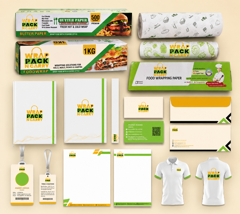
Based on the portfolio direction, this brand needed more than a logo mark. It needed a visual system that could carry the same personality across packaging, website banners, and brand touchpoints while still feeling simple, premium, and easy to trust.
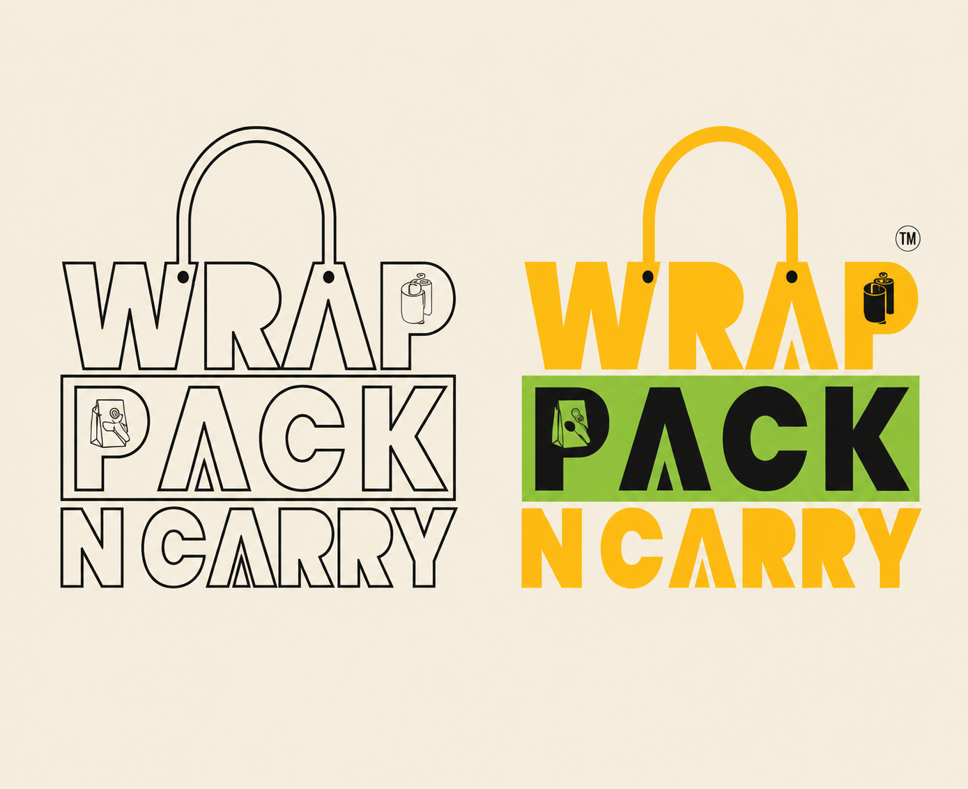
The identity is positioned to feel warm and practical, using a straightforward visual language that reflects protection, movement, and product care without becoming visually busy.
Typography, spacing, and supporting graphics are treated as one system so the brand reads consistently across digital presentation, printed packaging, and promotional creatives.
Earthy beige, rich brown, and soft gold tones help the brand feel grounded and premium, which fits a packaging-focused identity better than loud or disposable visual cues.
Every branding decision supports recall: the logo remains legible, the palette stays distinct, and the overall look is built to be remembered quickly in both online and offline formats.

A practical product range built around food wrapping, takeaway carrying, serving, and delivery needs, with each item reflecting the packaging formats shown below.
Oil-resistant paper ideal for wrapping greasy food items neatly.
Reliable paper suitable for baking, packing, and food wrapping.
Smooth-finish paper designed for easy wrapping and handling.
Strong and durable paper bags for takeaway and carrying.
Eco-friendly tableware for hygienic serving and food presentation.
Strong pizza boxes made for safe packing and delivery.
Along with the website and packaging visuals, this project also included branded stationery to keep the client identity consistent across everyday business touchpoints.